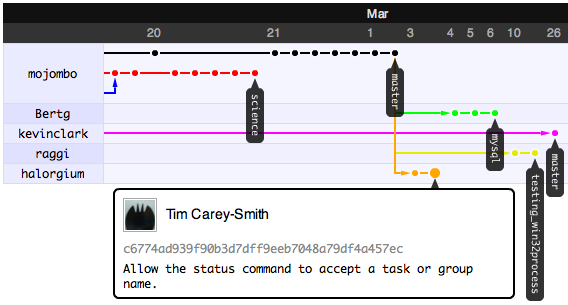
Our goal here at GitHub is to break down the barriers that normally impede collaboration. One of the biggest challenges that we face as developers is keeping track of what other contributors have done. I’ve spent the last month working on GitHub’s answer to that problem and so we’re very pleased to announce the interactive GitHub Network Graph Visualizer!
Above you’ll see a screenshot of the network graph of my god repository (click it for the real deal). On the left hand side is a list of GitHub users. Across from each user is drawn a graph of commits. Since I’ve asked for the graph to be drawn with me (mojombo) as the root, every commit on every branch that I currently have in my repository (mojombo/god) will be graphed across from my name. If you look at the second user in the list (Bertg), you’ll see that only commits that appear in his repository (Bertg/god) but not mine are drawn across from him. The third user (kevinclark) has commits that appear in neither my repo nor Bertg’s repo. And so on.
When you look at the graph you are seeing every commit on every branch of every repository that belongs to a network. But you are seeing each commit only once. Let that sink in for a second. I find that many coders are so used to a centralized SCM that they miss the fact that our Graph Visualizer is actually showing and connecting disparate repositories. Git makes this possible and once it hits you, it can change everything.
Think of it like this. If I draw the graph with myself as root, then the graph shows a sort of to-do list of code that I haven’t pulled into my repo yet. When I want to catch up on what the community has been doing in their forks of my repo, I can hit up the graph and see immediately what others have been up to. If I were to pull in Bertg’s changes, the next time I see the graph, Bertg will no longer be shown at all because he will no longer have any commits that I do not. Keep thinking to-do list and you’ll understand the graph.
This method of drawing the graph may seem odd at first. If both Alice and I contribute to merb-core and at some point Alice pulls my commits into her repo, then I may not be shown on the network graph at all (if the graph ordered her before me). My commits would have already been drawn in her repo. It is important to realize that the graph is about code not ego. My code may be in my repository and yours and many others. Our individual repos are simply vehicles for introducing our code to the world. If we learn to let go of our code a little bit, we are rewarded ten-fold by what the community or our coworkers will do with that code.
You can move around the graph by clicking and dragging it with your mouse. If you click in the graph, then you can use the arrow keys or vim movement keys (hjkl). Hold down the shift key while hitting left or right and you’ll go to the beginning/end of the graph. Press t to show/hide the tag markers. Hover over a commit for details about it. Click on a commit to be taken to that commit in a new window (makes it easy to come back to the graph without losing your place). Click a username to redraw the graph with that person as the root.
Here’s a few more graphs that show some complex branching:
You can see the graph for any repo by clicking the Network tab.
